Role - Researcher, Designer | Tools - Figma, Maze | Year - 2024
Problem
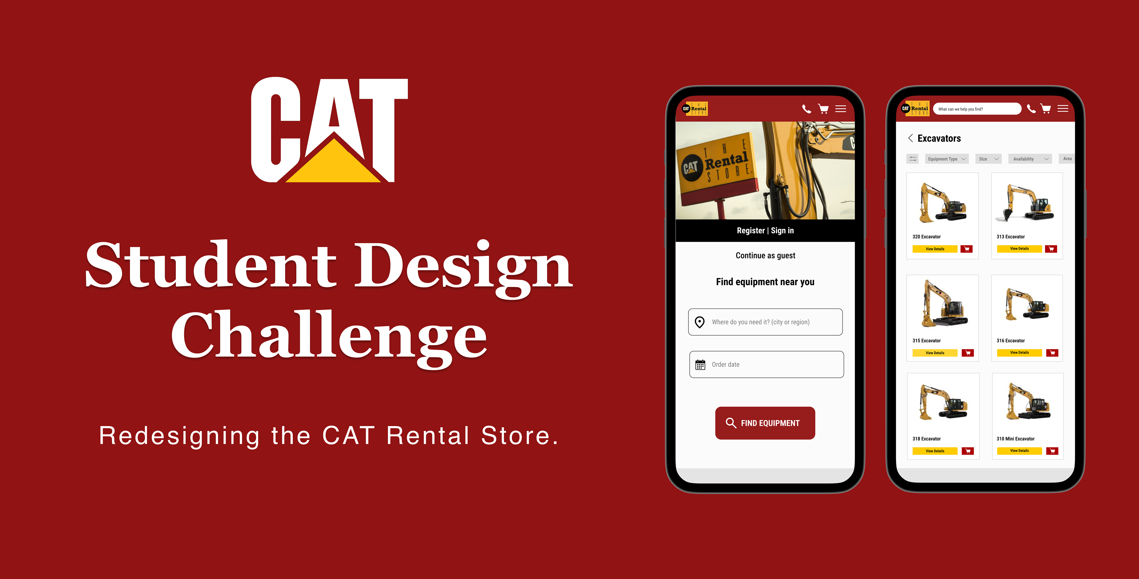
A Complicated Rental Process Hurts Customer Experience and Business Revenue.
The current Cat Rental Store website lacks a simple and intuitive way for customers to rent equipment attachments, leading to compatibility issues and incomplete rental orders. This confusion leaves some customers unaware of available options, resulting in missed rental opportunities and potential revenue loss for the business.
_____________________________________________________________________________
The Solution
Modernizing the Cat Rental Store with a Simple, Mobile-First Rental Experience.
Our mobile redesign of The Cat Rental Store revolutionizes the way customers rent equipment attachments. By prioritizing user-friendly navigation, compatibility checks, and a streamlined rental process, the new design ensures a seamless and accessible experience, allowing customers to efficiently manage rentals anytime, anywhere.
_____________________________________________________________________________
Key Features
Improving User Experience
Our redesign was based on a handful of key features, including: organization, clarity, simplicity, and confidence.
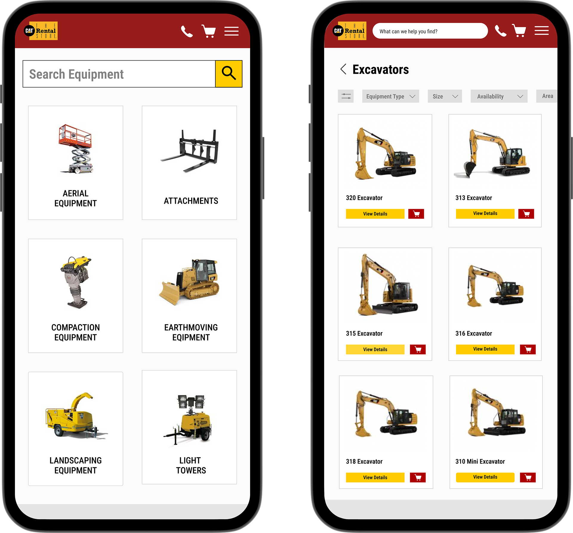
Organization
Our new catalog pages provide a clean and simple grid layout that makes browsing and selecting equipment effortless. By showcasing only significant product information, we ensure customers can make informed decisions quickly and confidently.
_____________________________________________________________________________
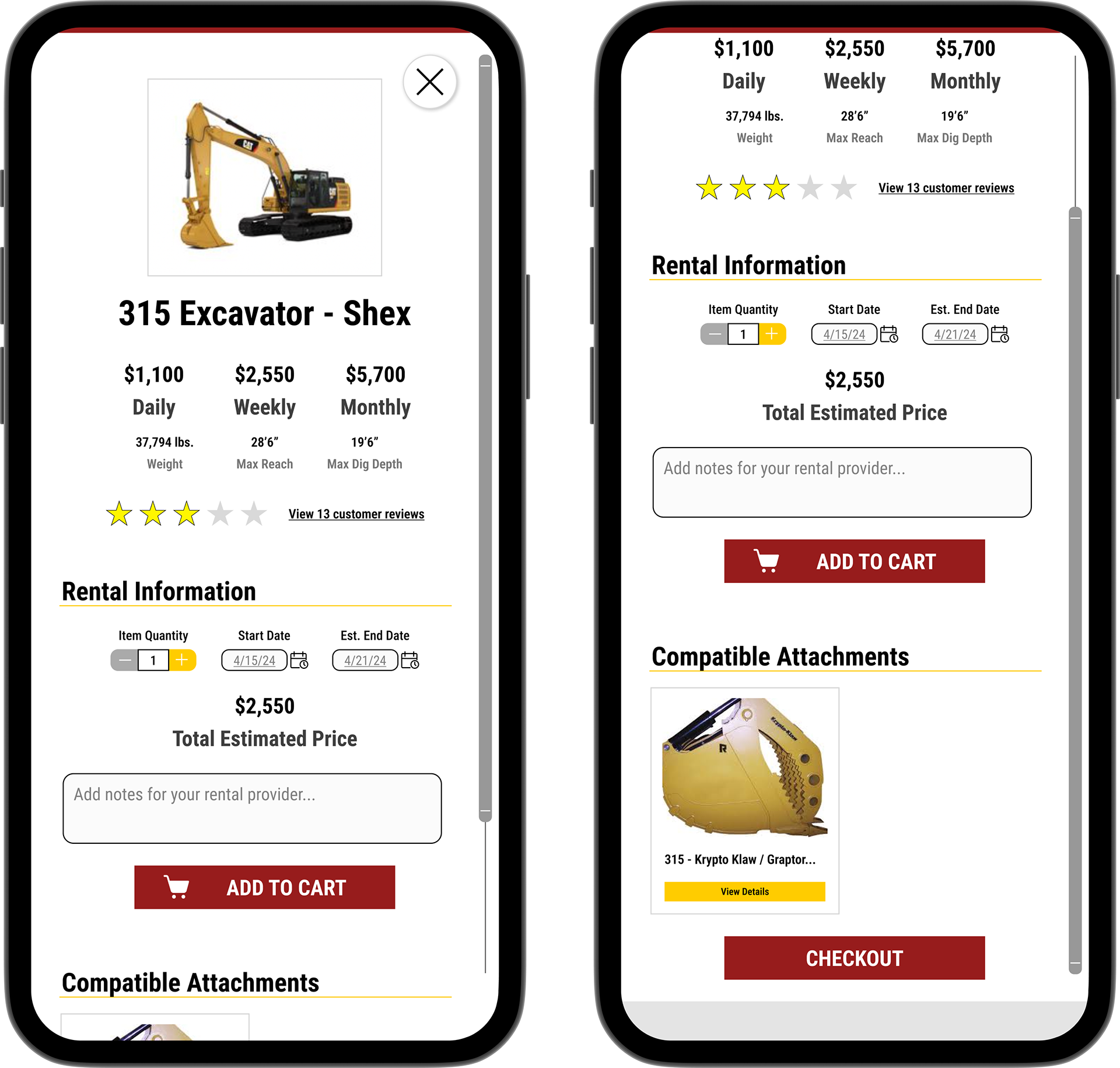
Clear Display
The product screens provide a clear overview of pricing options and simple rental selection tools. The inclusion of compatible attachments ensures customers can easily find and add the right equipment to complete their orders seamlessly.
_____________________________________________________________________________
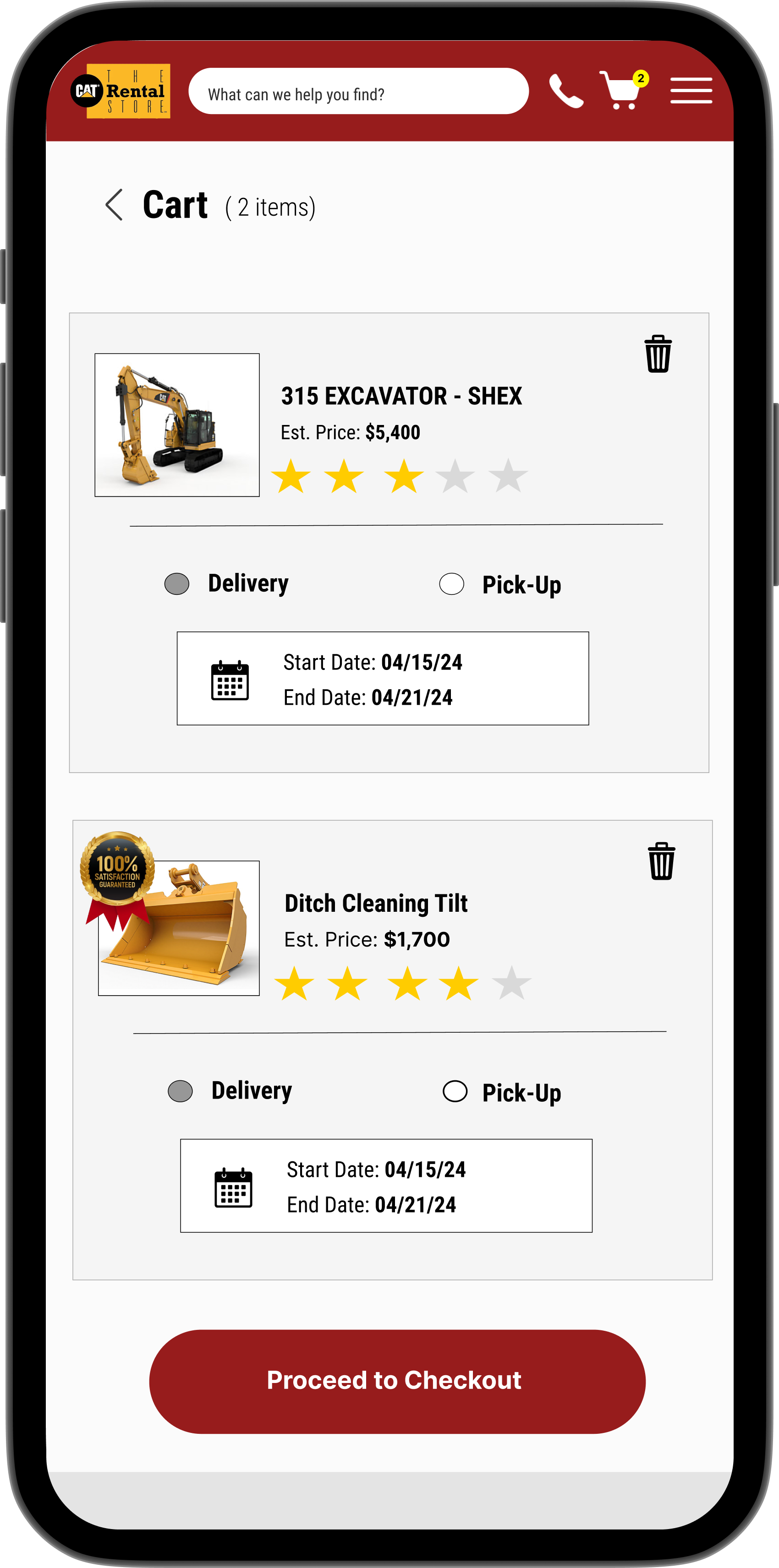
Simplicity
The cart screen provides users with a clear and organized summary of their selected rentals. Key features such as estimated pricing, delivery or pick-up options, and customizable rental dates ensure customers have full control over their rental experience.
_____________________________________________________________________________
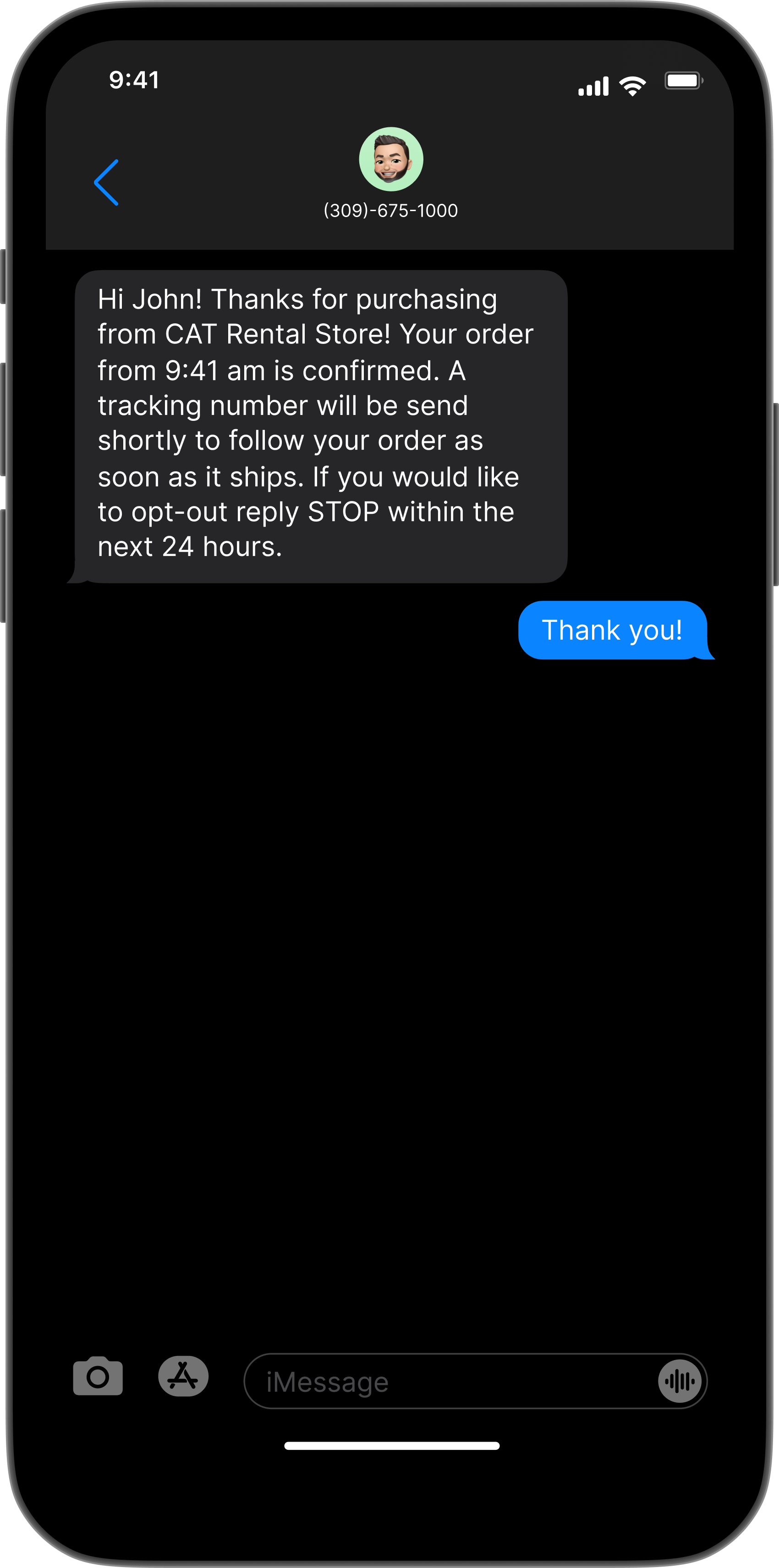
Confirmation
The order confirmation text message feature provides customers with reassurance and real-time updates on their rental orders. This modern addition enhances communication and customer satisfaction while offering an opt-out option for flexibility.
_____________________________________________________________________________
Research
Understanding User Needs.
Through user interviews, competitive analysis, and various research methods, we identified pain points in the rental process, such as compatibility confusion and a lack of mobile-friendly features. These insights guided our design decisions to create a more seamless and user-focused experience.
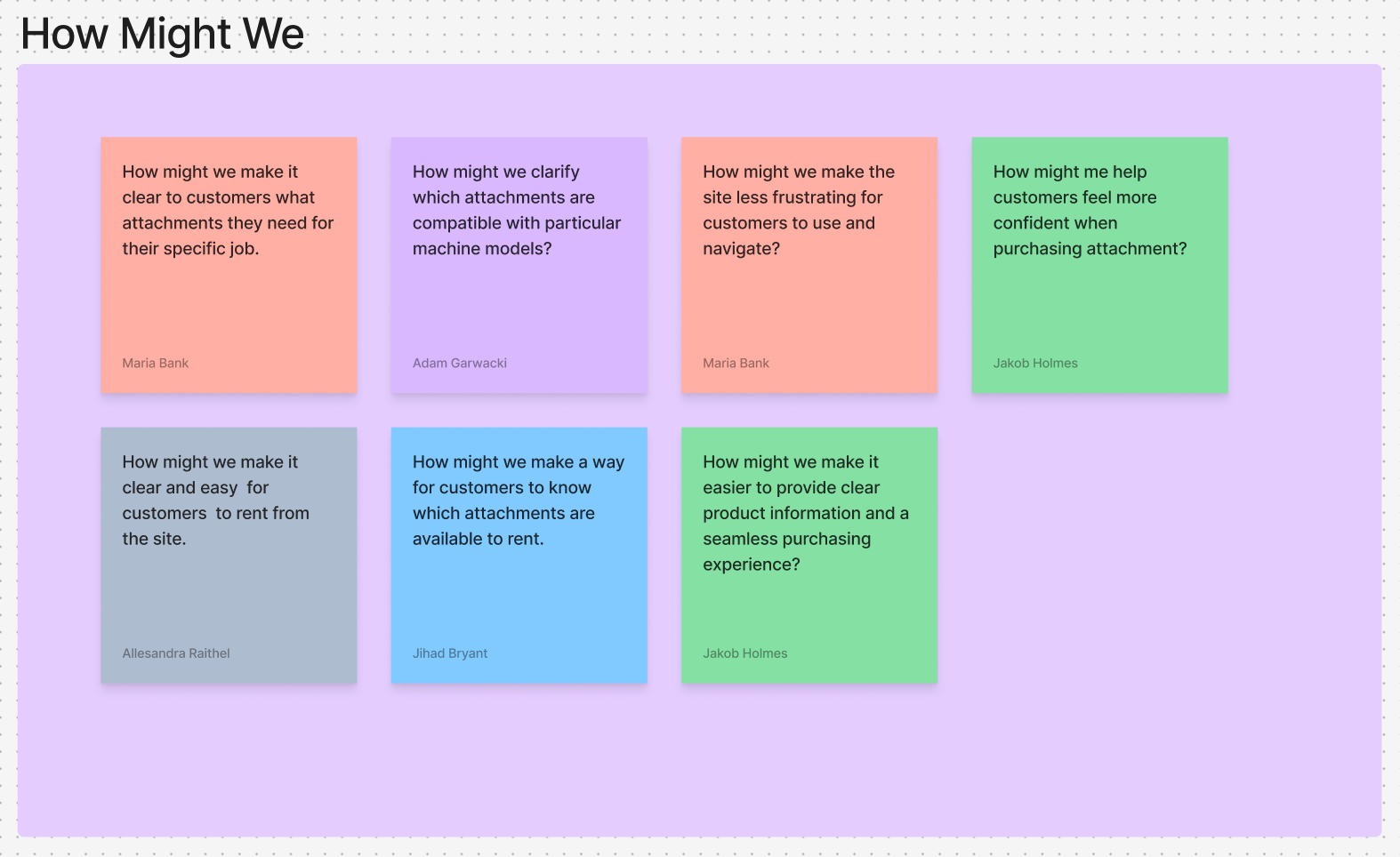
We began with a "How Might We" exercise to openly brainstorm potential solutions for our main consumer problem.
_____________________________________________________________________________
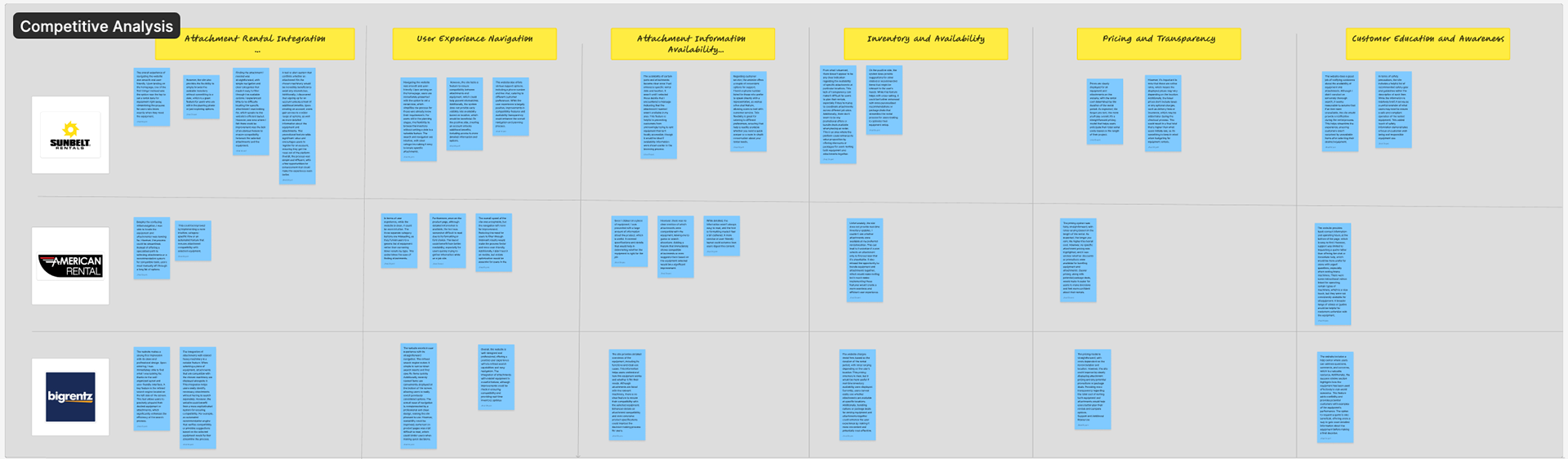
Insights for Innovation
A comprehensive analysis of key competitors, focusing on their approaches to rental layouts, user experience navigation, inventory management, and pricing strategies. This research highlights best practices and potential gaps that will guide innovative solutions.
_____________________________________________________________________________
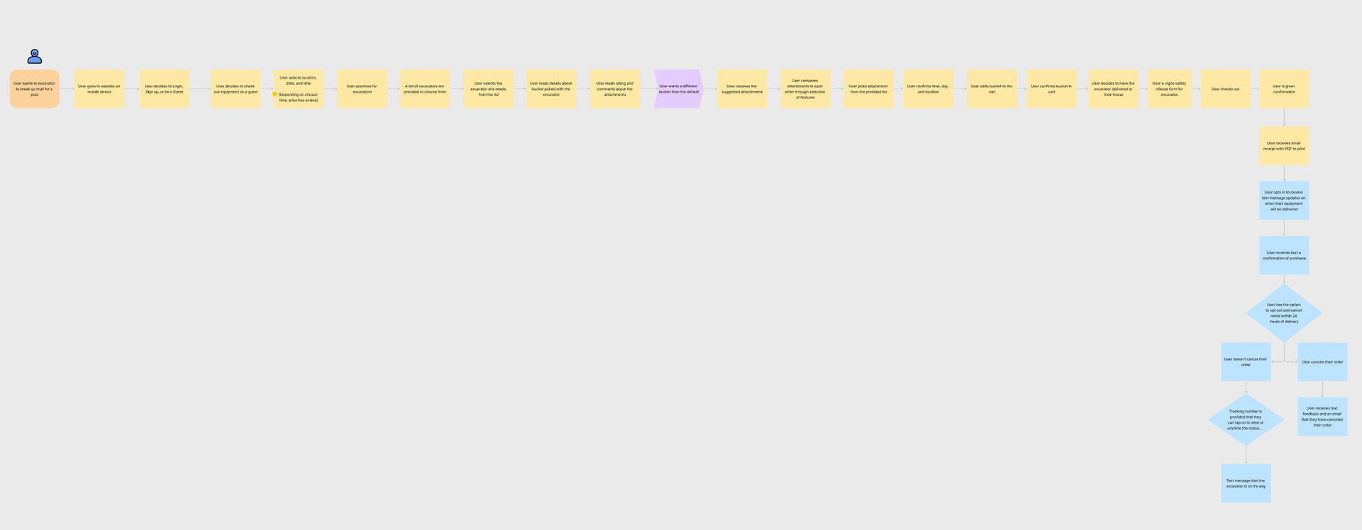
Mapping the Customer Journey
A detailed visualization of the steps users take to browse, select, and complete their attachment rental process. This flow highlights opportunities to streamline interactions and enhance user satisfaction.
_____________________________________________________________________________
Why Mobile?
My team and I decided on a mobile approach because we recognized it would better suit the needs of our target demographic—busy or inexperienced customers frequently on the go who rely on convenience and accessibility.
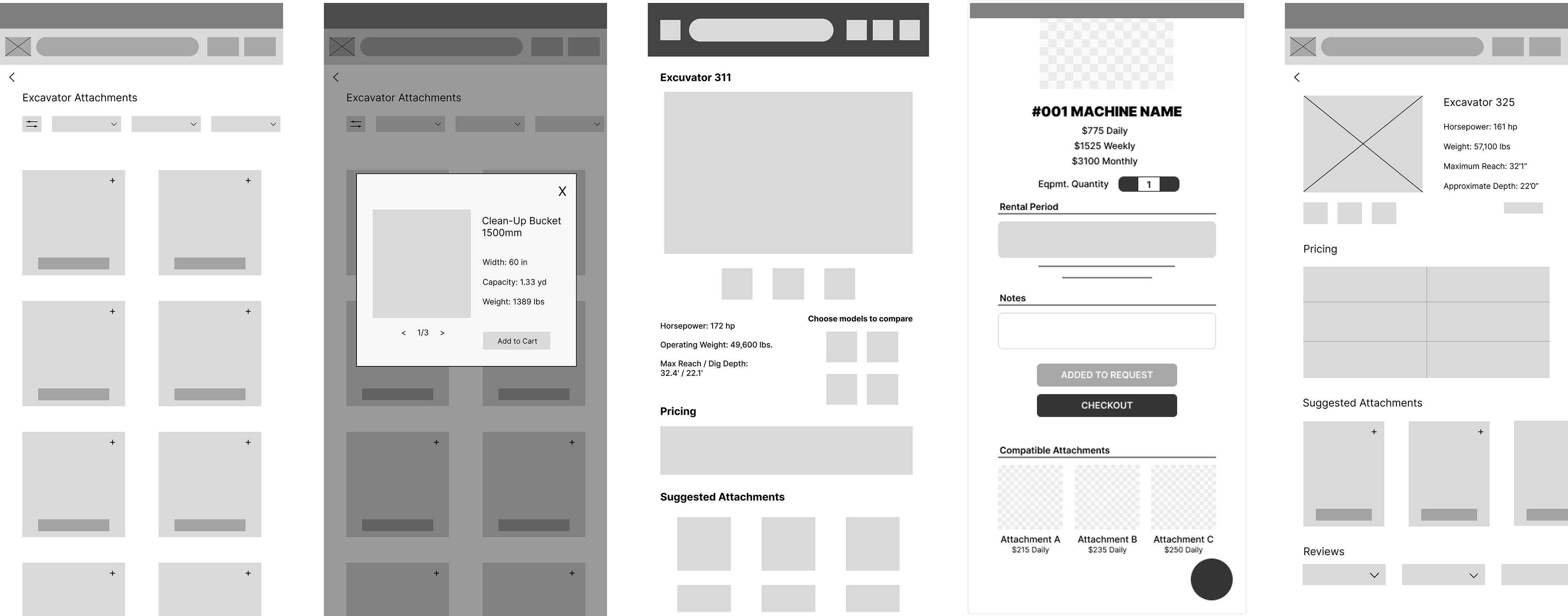
Below are images of our early wireframes, where we focused on simplicity and efficiency.
_____________________________________________________________________________
Our Final Presentation
_____________________________________________________________________________
What I Learned
The Importance of Iteration Time
Had we been given more time, we could have explored design solutions in greater depth, conducted more prototyping cycles, and refined the testing phases. This experience taught me how critical iteration is to producing a polished and effective final product.
Had we been given more time, we could have explored design solutions in greater depth, conducted more prototyping cycles, and refined the testing phases. This experience taught me how critical iteration is to producing a polished and effective final product.
Expanding to Desktop View Prototypes
Focusing only on the mobile version limited the scope of the design. I learned that considering a desktop view addition later in the process could provide a broader understanding of user needs across different devices, allowing for a more adaptable and comprehensive solution.
Focusing only on the mobile version limited the scope of the design. I learned that considering a desktop view addition later in the process could provide a broader understanding of user needs across different devices, allowing for a more adaptable and comprehensive solution.
The Impact of Deeper User Testing
We saw that conducting more extensive user testing at different stages could have uncovered potential issues earlier. This reinforced my understanding of how essential thorough testing is to improve usability and identify areas for improvement.
We saw that conducting more extensive user testing at different stages could have uncovered potential issues earlier. This reinforced my understanding of how essential thorough testing is to improve usability and identify areas for improvement.
_____________________________________________________________________________
Link to my Figjam file HERE.
_____________________________________________________________________________